


Apple x NUS, 2026
SpatialRehab
An Apple Vision Pro app for early-stage dementia care, built in a three-day Apple x NUS hackathon. A calm spatial companion where a person practises the walk home from a chair, and a caregiver can watch them improve. First Place Overall and Best Interface Design.
- My role
- UX/UI and spatial design: flows, onboarding, prompts, accessibility
- Team
- Five: 3D, visionOS development, clinical research, analytics, and me
- Timeline
- Three-day hackathon, August 2026
- Awards
- First Place Overall and Best Interface Design, Apple x NUS
The problem
Dementia takes the everyday first. Long before anything dramatic, the small skills that hold a day together start to fray: the steps of a morning arrive out of order, a walk taken for thirty years stops feeling familiar, names slip away from faces.
It is not a small problem in Singapore. About 1 in 11 people aged 60 and over live with dementia, the number is projected to roughly double to 152,000 by 2030, and 74% of family caregivers say they are overwhelmed. Our goal was not a cure but keeping the everyday doable, at home, for longer.
Research
With three days, research meant reading, not fieldwork. Our clinical lead worked through dementia rehabilitation papers and Singapore's own studies, and I turned what we learned into rules every screen had to pass.
Errorless learning
People with dementia keep procedural memory far longer than the memory of whether they got something right. Correcting a mistake teaches the anxiety along with the error, so support has to arrive before a mistake can happen.
Cue first, then fade
Prompts should appear before a wrong answer is possible and reduce over spaced repetitions, so the skill ends up with the person rather than the headset.
Short, seated sessions
Sessions of 20 to 30 minutes, in line with Apple's headset guidance, and seated movement only. No smooth rotation or acceleration that could disorient.
Caregivers need an answer in seconds
"Is this getting better or worse?" is the question a family member actually asks. It should take ten seconds to answer, not guesswork.
Design process
I owned the user experience and the spatial interface: menus, onboarding, prompts, progress and accessibility. Every design decision went back to one rule from the research: the patient is never set up to fail.
- 01
One calm window
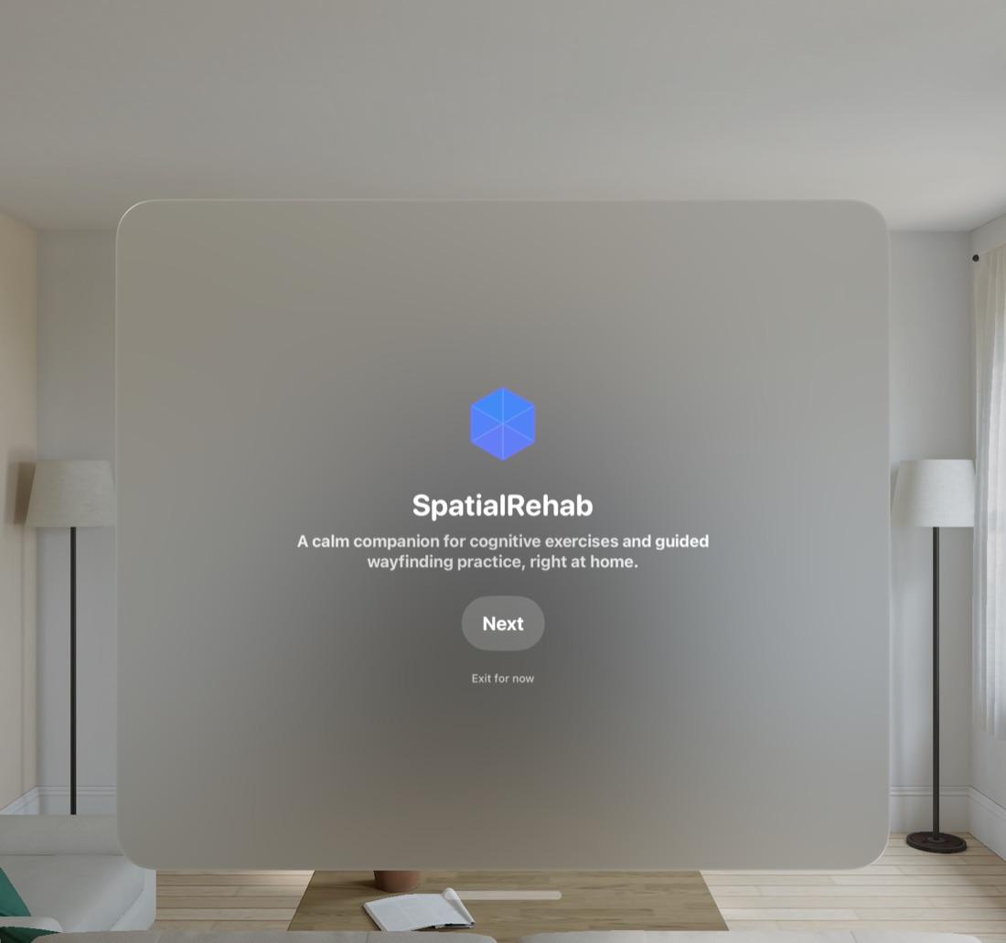
A single window with one clear next step, never a wall of choices. During immersive exercises the window steps aside and the room becomes the interface.
- 02
No score reaches the patient
No percentage, checkmark or red and green ever appears. Mismatches quietly reset, retrying is free, and results go to the caregiver view instead.
- 03
Who am I?
I built the Who am I? name card and the family tree, with a moving portrait for every relative. Who you are and who your family is stays one tap away, wherever you are in the app.
- 04
The demo is the story
I restructured the pitch deck into 18 slides that follow the live demo in order, so the judges saw the reasoning and then the product doing exactly that.
Design frames
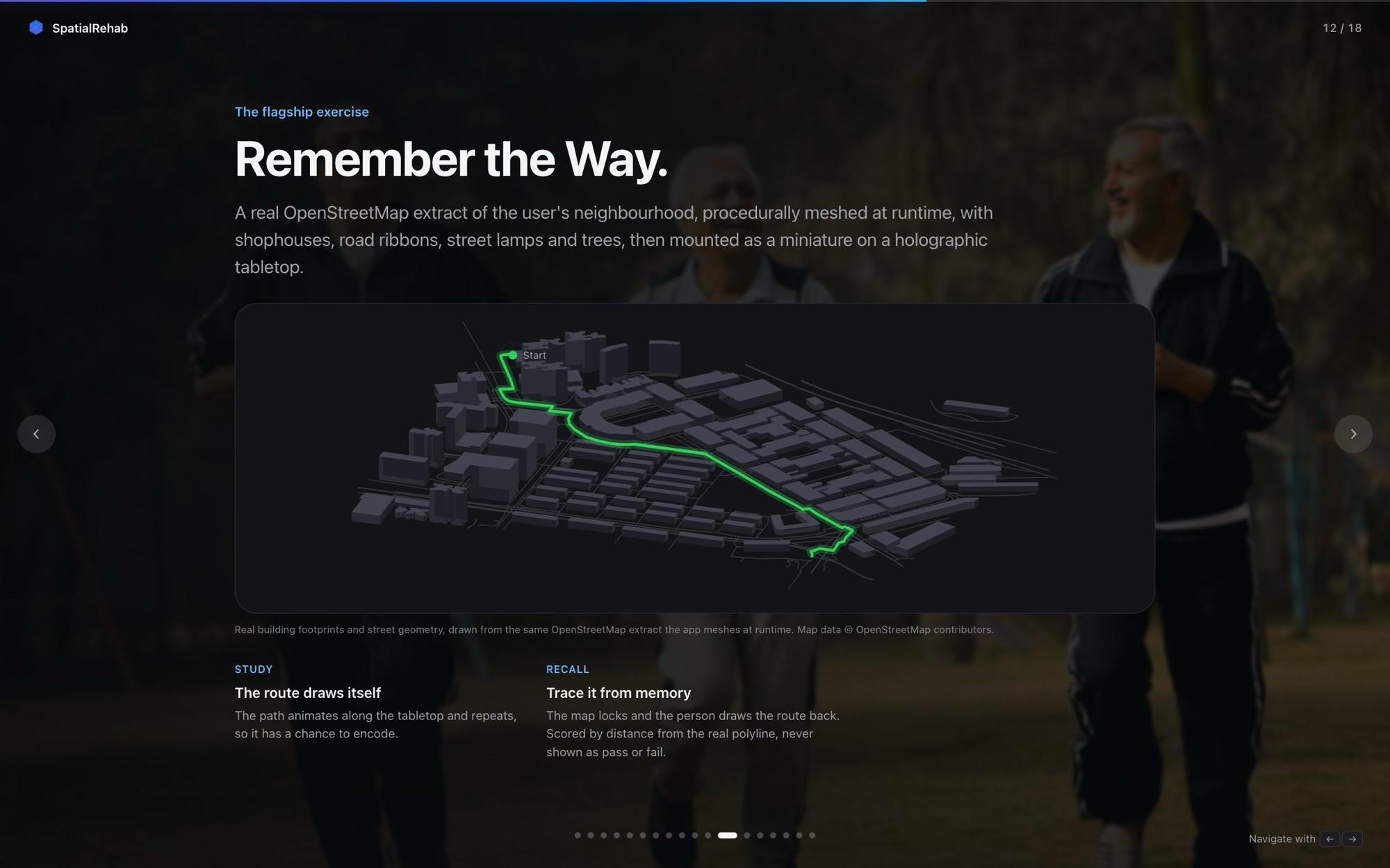
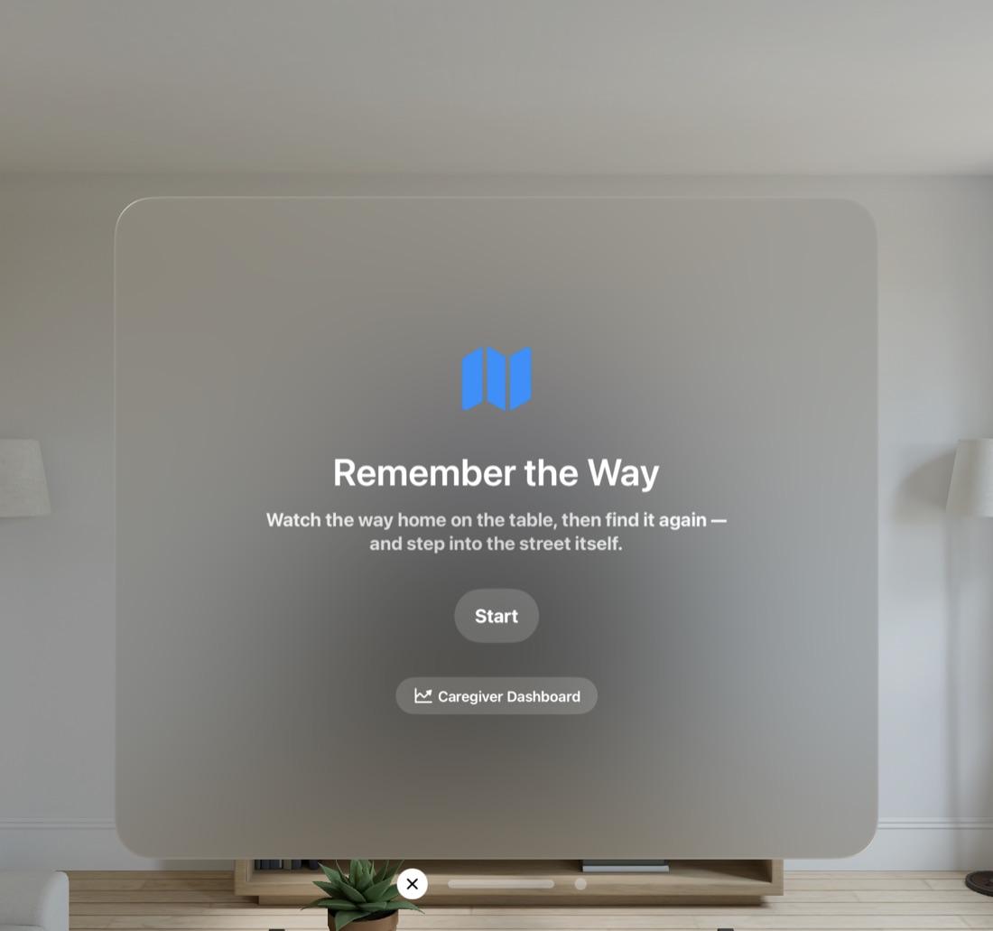
The first-launch flow and the core exercise, as designed for the headset. One window, one action, and plain words before anything starts.
Iterations
How SpatialRehab changed on the way to what shipped, step by step.
Start7 to 8 Aug
Wide first
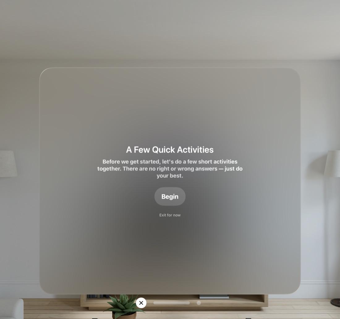
We started broad: an augmented reality tea-making task, five rehab activities, a first-person walk through Yishun that I built, and an eight-game cognitive baseline. Too much for one person in a headset.
Focus8 Aug
Cut to one activity
We focused the app on a single daily exercise, Remember the Way, merged two competing instruction panels into one, and cleared the flat window during the activity. My Yishun walk was cut to make room.
Comfort8 Aug
Seated and calm
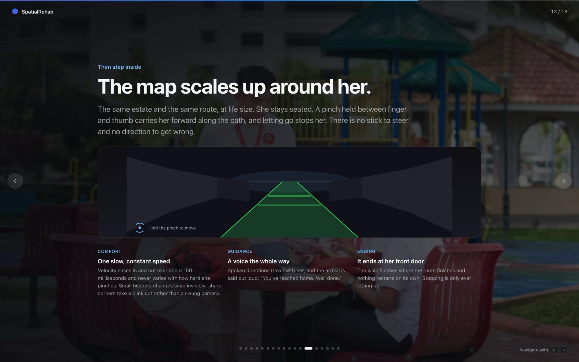
The walk home became seated, constant speed and blink-cut on sharp turns. The map scales up around her and a voice guides the whole way.
Care8 to 9 Aug
Progress you can see
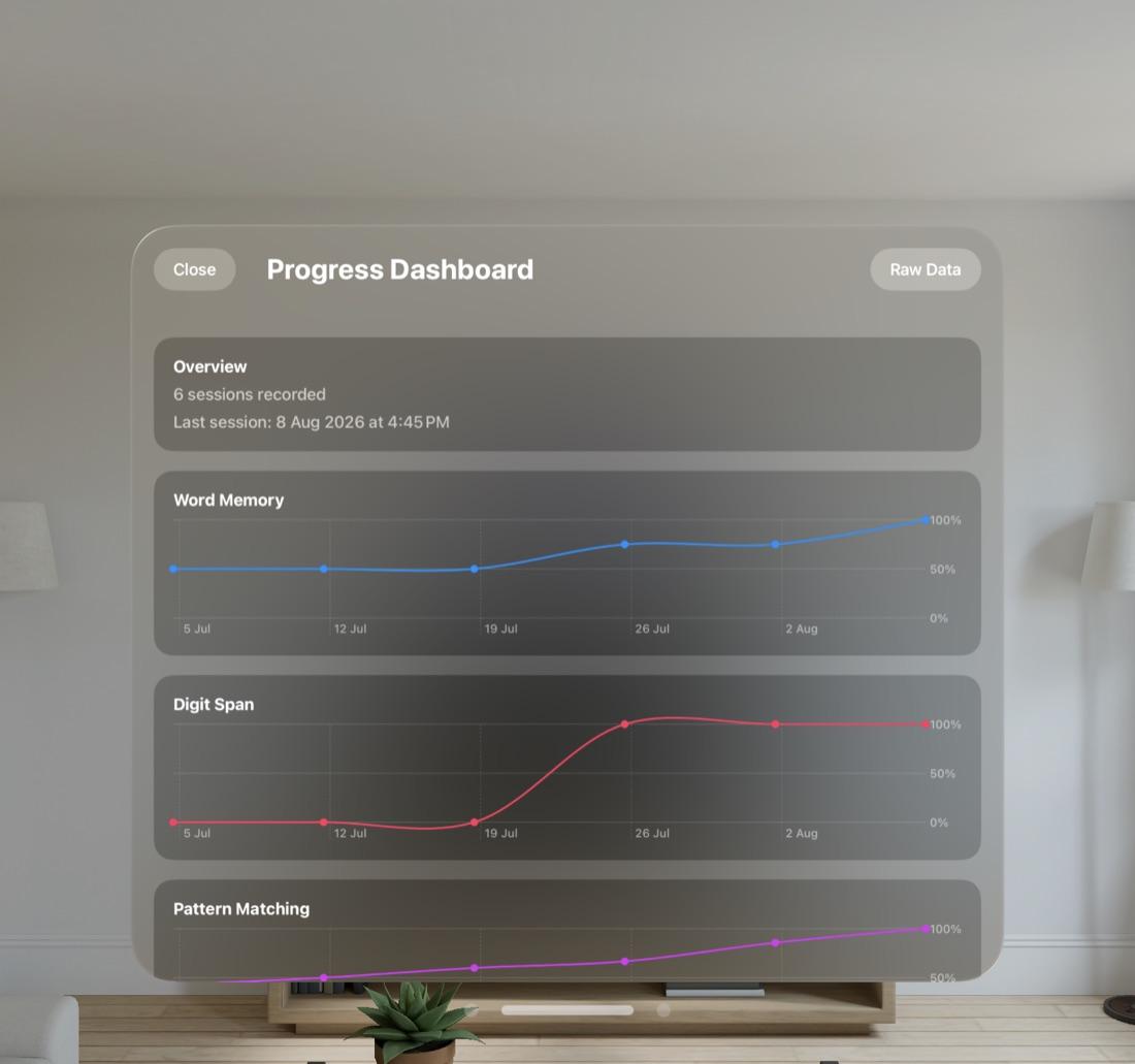
The caregiver dashboard turned every session into a trend line per game. The patient sees encouragement; the family sees whether things are getting better.
Challenges
01Designing without failure states
- The challenge
- Games and exercises naturally have right and wrong answers, and most interface patterns signal both.
- How we solved it
- We removed every failure signal. Mismatches turn back over, a clock drawing has an unconditional Clear, wrong turns never block the route, and all scoring moves silently to the caregiver view.
02Comfort in a headset
- The challenge
- Walking a route in virtual reality can cause motion sickness, a real risk for older users.
- How we solved it
- Locomotion is seated and constant speed, sharp turns cut instead of rotating, and the immersive world blends with passthrough so the real room never disappears.
03Too many ideas for three days
- The challenge
- By the second day we had more activities than we could polish, and the app was starting to feel like a menu.
- How we solved it
- We cut to one daily exercise and one clear next step. It meant dropping work, including my own Yishun walk, but it is what made the interface feel calm.
04Showing judges a headset experience
- The challenge
- Only one person can see inside a Vision Pro at a time.
- How we solved it
- The deck follows the live demo slide by slide, so the room could follow the reasoning while one judge wore the headset.
Impact
A three-day hackathon project, judged rather than shipped. No user testing was possible in that time, so the measure is the competition and what we delivered.
- place overall at Apple x NUS
- 1st
- Interface Design award, for the area I owned
- Best
- from an empty visionOS project to a judged demo
- 3 days
- baseline games, none of which ever shows the patient a score
- 8
- deck slides in the order of the live demo
- 18
- failure states shown to the patient
- 0
Lessons learned
- 01
A rule beats a feature list
"Never set the patient up to fail" settled more design arguments than any discussion of features. One clear principle let five people make consistent decisions fast.
- 02
Cutting is a design decision
Dropping activities, including my own, is what made the app feel calm. Saying no on day two was worth more than one more feature on day three.
- 03
Test with the people it is for
We designed from research papers alone. With more time, the first step would be a session with caregivers and older adults, because comfort in a headset is something you can only learn by watching.